Best Color Scheme for Your Home
Colors play a very vital role in our lives. Without colors our life is dull and boring. Through different colors we can express our emotions, love and language. These colors are the basic elements that make us happy and alive. When it comes to decorating your home with beautiful colors then there are various important things that you need to keep in mind.
You must try to take in the impact that colors have in our lives. They can really change your whole outlook. Consider how color and feel in the natural world can act as your guide. Color can be lively and impressive, or tranquil and comforting, we are all born with our individual response to color. If a color bugs you, get rid of it. Color is influential and individual, each one has its own exceptional color palette.
Understanding the true meaning of different colors can be very difficult because each color depicts something to everyone. It is very difficult to make comparisons. Every color that you see in the world has a large spectrum of meanings and hues.
You must stay within the palette you are fascinated to, and your color choices will make an ambiance you will take pleasure in every day.
You must decide what colors are your favorites. You don’t have to immerse the walls in bright planes of soaked shades to attain a sense of color. Select items in your colors, such as accessories, fabrics, equipments vases, dishes, furniture items throws, lamps, and flowers, and place them where they can feed you with glimpse. Small details will interrupt the space with a sure touch.
Color creates mood

Color has an influential emotional force and can control our state of mind. Some colors are regarded as curative, making us feel content and well, while others have a harmful impact, inducing depression. Many of these touching responses to color have become terms in everyday speech. People often tend to use phrases like black moods, to feeling blue and “seeing red.
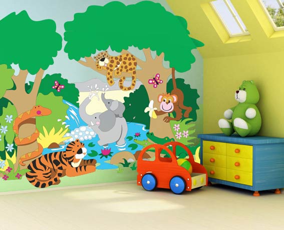
For example, the use of flowers in the home illustrates the mood-improving powers of color. Yellow flowers will generate a brilliant and happy atmosphere, while white or green arrangements create a feeling of peaceful and tranquility.
Top Colors
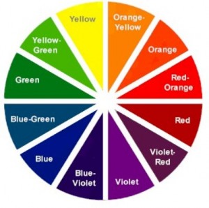
You will see that Yellow is the happiest color of the range. On the color wheel, the reverse of yellow is violet, and combination yellow with purple or blue compliments well.
Orange is a color that depicts warmth, the hottest color in the range, it can be a strong and demanding color to work with, but the results can bring a festival. Mixing brilliant orange with bright reds and yellows, or rich burgundy and plum works well. Orange and purple are a cheerful team.
The next color is bright Pink which is a optimistic, content color, is a drenched hue with mauve and red in its color makeup.
The color that people prefer the most is Blue. Blue is the decisive fresh color. Sky blue, shades of dove gray and fawn, and pure white make a passive retreat to soothe the soul, sending a message of peacefulness and tranquility. Cobalt blue can be brilliant and vivacious as well as creating a feeling of calm. Pale shades of blue against white, brown and quiet gray are gentle colors to work with in bedrooms, bathrooms, living rooms. Their quiet delicacy quite plainly allows you to relax.
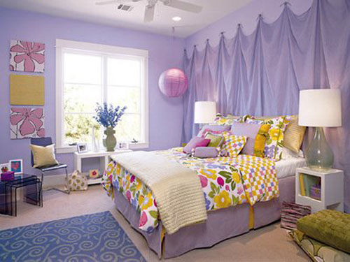
Another color that would work wonders for you is Mauve. Lilac goes best placed next to white more willingly than dark wood. Explore deep ceramic, solids instead of patterns, predominantly floral.
You will see that Violet tones of shell pin are particularly agreeable in bedrooms and bathrooms if you want to make a clean, calm ambiance. All shades of violet and lavender look magnificently fashionable partnered with silver groups and gray-greens
I would like to tell you that Green, intensely soothing, is a central color in beautify, associated with scenery and the sea, it may be one of the reasons people find it so easy to live with. Bathing room in plain green, using shade of apple, pea, and elation, brawny and slight at the same time, always warms the walls and lifts the feelings. Calming and eating will seem the most normal thing to do surround by such a comforting range of colors.
The best color that would work well with all the backgrounds is White. White, mixture of white on white are always spotless and stimulating (gray-white, bone-white, dirty white).White is always unadulterated and attractive, a good way of counteracting crowded thoughts and busy beautification.
You will achieve the color Cream by mixing yellow and white. . It is a calming and result on the eyesight, but also stylish. Hues described as oyster, ivory, magnolia, shell, and vanilla all sit within the color band.
Red is lively more than inactive, inspiring rather calming. It is the color of fire, obsession, power, spirit, power, energy, love, sexuality, and risk. It suggests both love and hatred. If you want to have fire power in your home, that is the perfect color. Rich red is wealthy and considerable, impressive and seductive. Use it with self-assurance on a grand scale or as obvious highlight for glamour and luster. Red for drama, purple for fervor, rose for sentiment.
Another color that you can select is Rust. Rust represents the magnificent display of fall colors when shades of rust prevail. Mix rust with burgundy, deep reds and plum whilst paler shades can go well with light yellow.
Plum is a classy color. As a close relation to black, plum is a retreating color that absorbs light. To make plum look grand in a formal Victorian manner, mix it with grey. By difference acid lime-green makes plum look fresh and modern. Plum by itself is quite moody- even a touch of miserable.
If you want to add richness to the ambiance then Burgundy is the color for you.
You will see the Silver is really a very trendy color.


